Bitcoin In Three Charts
I'll examine the Bitcoin price action in the following charts...and it's not bullish.
Happy Sunday everyone. 🙌
Quick report here…
BITCOIN
Chart 1 of 3:
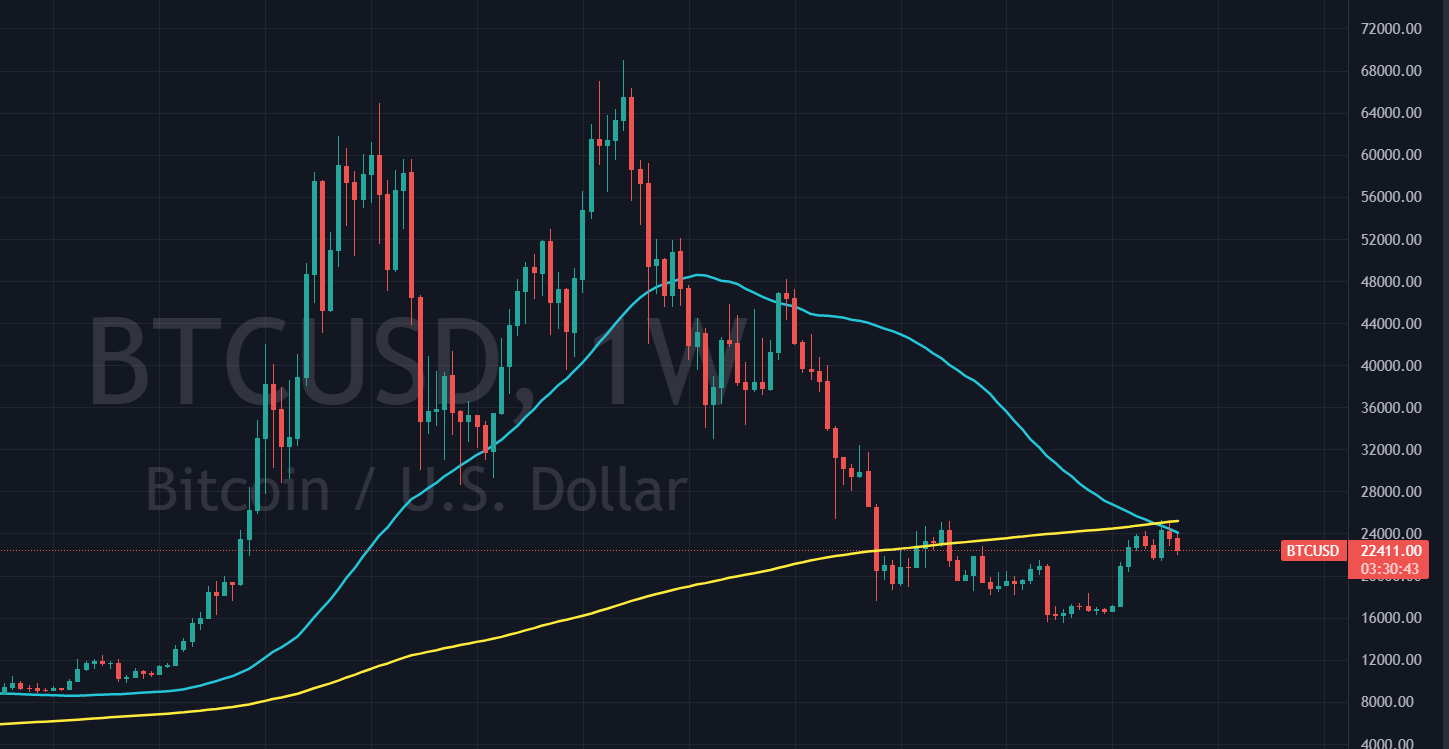
Weekly chart:
Ugly chart…can’t seem to get above the 200 and 50 week moving averages. IF it does…we might start looking better.
But until then, I’m intermediate term bearish. 🐻
Chart 2 of 3:
Daily Chart:
Zooming in from the weekly chart to daily chart below 👇 , we can see price broke above the 50 day and 200 day moving averages in mid January. Bullish, of course.
However, price action is starting to dwindle, showing signs of weakness, breaking back below the 50dma (blue line) on good volume (not shown in this chart).
Chart 3 of 3:
4-Hour Chart
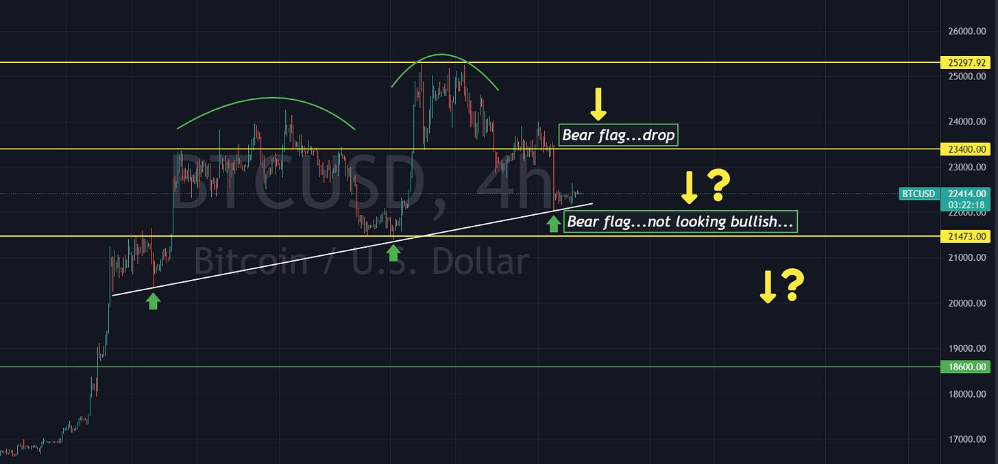
Zooming in yet further to the 4-hr chart we can see price hit overhead resistance several times and was rejected each time before breaking down.
Bear flag…then broke to $22,000…TO THE PENNY…and is now forming yet another bear flag at the white support line.
For those new here, a bear flag typically breaks down to the next support level which, in this example, is the $21,500 area.
If that breaks, we are likely back below $20,000 to the 200 day moving average (chart 2) which is currently at $19,700…and starting to curl ever so slightly down.
Until this price action changes…me no likey.
I we continue to break and head towards the $20K area…I’ll look to short Bitcoin with BITI, which is a ProShares Short Strategy ETF.
Eric


