


Let’s talk about charts.
Adding charts to your investing could be the single most important thing you do to improve your ROI or return on investment.
Why?
Charts allow you to see historical price patterns and can tell you, for example, if you are in a bull phase (uptrend) or a bear phase (down trend). Charts will tell you if lots of people are buying or lots of people are selling. Charts tell you if they are at the top of a channel and ready to roll over (time to sell) or the bottom of a channel and curling up (time to buy).
Trends. Momentum. Patterns. Volume.
As an example, see the chart below…

Without knowing anything about charts or what this is a chart of, you can see this was in a period of trending higher…peaked…reversed trend…and is now trending lower. This is a chart of the Nasdaq 100, or the tech index.
There. Now you are an expert.
Okay, maybe not yet but it’s a start. I often say the charts talk to me. They give me hints, clues, and whispers. These clues oftentimes coincide with some macro fundamental or event.
This chart is telling me some event or macro fundamental happened at the peak. How do I know? The trend changed. In this example, it is obvious to the naked eye. My 8 year old can see this.
What was it?
The peak of this chart was November, 2021. Yup…start of the Fed rate hiking cycle. And in a rate hiking environment, cost of capital increases, margins decrease…and general stocks, especially growth stocks, get sold off.
If you didn’t know that before, you know that now. How? The chart JUST told you. (I told you too but I know you heard it from the charts too, lol)
Let’s back up a little bit…
What Is Technical Analysis?
Technical analysis is a trading method used to identify opportunities by analyzing simple trends gathered from trading activity, such as price and volume. Technical analysis can range from basic price and volume trends to more advanced techniques using oscillators and indicators for more precision and tactical trading.
For the purposes of my readers, I’ll keep it simple. Very simple.
So simple you’ll want to learn more and apply it regularly.
I’ll add this:
As a former skeptic of technical analysis and its accuracy, I now can’t imagine ever investing another dollar without first consulting my charts.
Let’s go a little further…
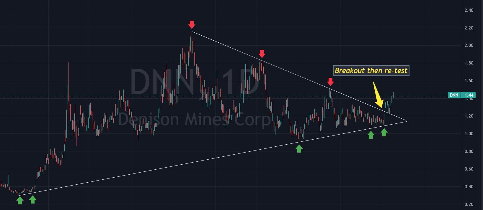
This is a daily price chart of Denison Mines, (DNN) going back since the bottom in October, 2021.
No drawings. No lines. No bias. Price goes up. Price goes down.
What does the eye see? Will price go higher or lower?
Is this a BUY or a SELL?

Now let’s look at the same chart below but this time I’ve added some trendlines based on price movement. I merely drew a trendline from the highs and the lows which formed a triangle wedge pattern. This is not a bias…this is a fact. As time moves from left to right in the chart, price consolidates and coils in a tighter range as it moves toward the apex.
This coil tells me a move is about to happen. Either UP or DOWN.
My BIAS is to the upside. Why?
As you can see, price broke out (wide range green bar) then re-tested the breakout point. Textbook. This classic break out then retest tells me price has a HIGH probability of moving higher.
Let’s look at volume now.
Same chart below, zoomed in. Notice the green rectangles highlighting the volume bars. We see price move dramatically higher on above average volume days. This is good. Heavy volume on UP days means buyers are stepping in. Most likely institutional buyers. Not buyers like you and me. BIG money.
When price broke out of the wedge, was volume supportive?
Absolutely. Heavy volume…up thrust in price. Love it.
Now…what do you do with this information?

When is the best time to buy?
In the example above of DNN, there are three entry opportunities where I would look to buy. Refer to chart 2 or chart 3.
Buy when price comes DOWN to the lower boundary of the wedge pattern. History has shown price respects this zone.
Buy when price BREAKS OUT from the upper boundary of the down sloping trendline, especially if VOLUME supports this.
Buy when price RE-TESTS the break out level. This is the best option but requires patience as not all breakouts will re-test. Be prepared to let those go.
Technically speaking…Denison is a buy for me.
Note:
Technical analysis is about probabilities, not certainties.
Let’s look at another chart
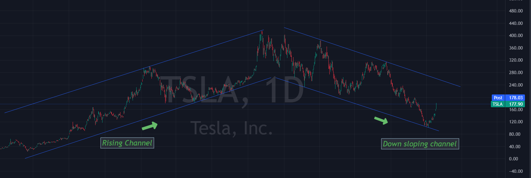
Tesla. The talk of the town.
Daily price chart. No drawings. No lines. No bias. Price moves up. Price moves down.
What does the eye see?
Is this a BUY or a SELL?

Now let’s add a little technical analysis.
Same chart. Two clearly defined parallel channels. The apex was the start of the Fed rate hiking cycle. We have CLEARLY been in a down trend. That said, price has moved up significantly in the last couple weeks but until that upper rail is broken, we are still in a downtrend.
How high will price move off that lower rail in the lower right quadrant of the below chart? We have moved up and down WITHIN the perfectly symmetric channel…to the penny. Coincidence?
No.
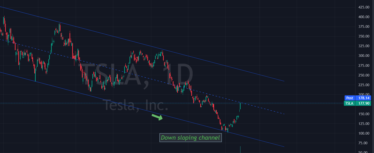
As I zoom in closer to the downtrend channel, we have perfect symmetry. Price has run up. Price is a bit overstretched. We are EXACTLY at the midpoint of the perfectly symmetrical channel at resistance.
Technically speaking…Tesla is a SELL for me.
Could it go higher? Of course. Remember, this analysis gives me probabilities. Not certainties.
As a reminder, NONE of this is to be taken as investment advice. I’m just a guy. A dude. A random on the internet writing a badasssss report called The Tobin Report. Lol
Okay, get over yourself, Eric.
That said, I hope you find value in these reports and can add bits and pieces to help improve your financial situation.
Please share this with someone who might give a shit.
Yes, I just said shit. It’s my newsletter…uncensored. Thank you Substack for allowing me. And thank you to this country for allowing me to say shit because freedom of speech is one of the things that makes our country great. I see too much manipulation and censorship. Bullshit.
Thank you for reading.
Eric