Hello everyone,
Eric here…back at it.
👉 First, I hope you all have a great weekend. It’s Friday and I’m looking forward to Opening Day at West Torrance Little League in Southern California this weekend. My oldest, Aidan, is playing so wish him luck! (especially since I’m his coach! lol) ⚾⚾
Market Timing
Before I get into the 3 stages of a reversal pattern…
I want to talk a little bit about the concept of “market timing” and using the charts to your advantage.
This article can apply to speculators and long term investors alike.
Hear me out…
As I’ve written many times in the past, charts can guide you as to whether it is a good time or bad time to put money to work, generally speaking.
What do I mean by this?
Let’s say you have $10,000 you want to put to work for you…and you recently heard of a great company on the news, from a friend, or here in The Tobin Report. (see what I did there?)
Do you invest in it?
What if you really believed in a company because you heard they make great products and you really, really, really believe in them?
“Everyone uses their product!”
I hear this all the time.
But does it mean NOW is the time to put that money to work?
Maybe. Maybe not. All I’m saying is when you add just a little bit of technical analysis to your investing, you increase your odds of success.
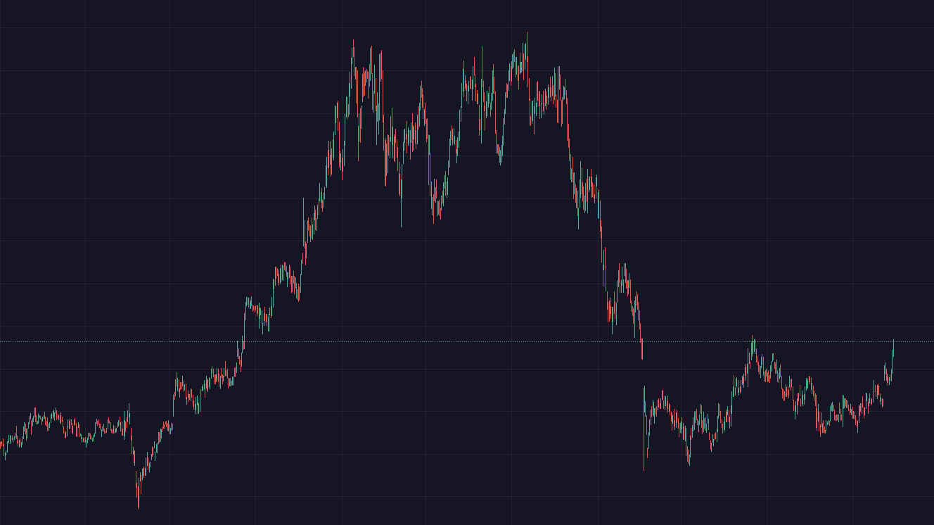
Example: look at the chart below. 👇 Is NOW the time to put money to work in this company you really, really believe in? 🤷♀️🤷♂️
Probably not.
Why not? To ME, this has already had a good run. This might be why you heard it on the news or from a friend. This doesn’t mean now is the time to buy it. Could it go higher? Maybe…but why buy a company that is no longer ‘cheap’?
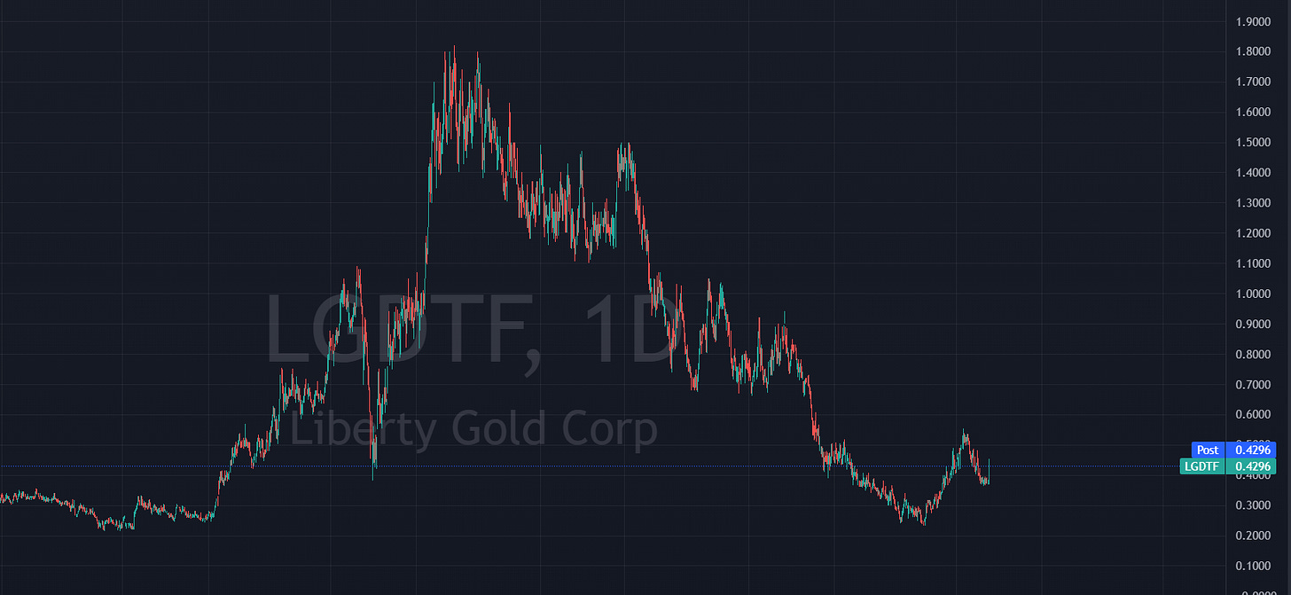
On the other hand, THIS stock looks like a chart I’d be interested in… 👇
Why? Well, we see it’s not at a peak. In fact, quite the opposite. It seems to have found a low and showing signs of recovering. It has more upside potential than the prior chart.
Remember the phrase, “Buy low, sell high”?
Of course you do.
However, easier said than done. I get it.
So let me help you……………
How to find the LOW in ‘buy low, sell high’
In order to find the low in stocks, it’s important to know what lows typically look like.
In order to do so, let’s look at the 3 stages of a reversal, indicating that a low has been in place.
3 Stages of a Reversal
Rejection or sell off - you don’t want to catch a falling knife. You need to wait until the stock STOPS selling off. IF you decide to enter during a selloff because you think the bottom is near, only add a small percentage of the total you plan to invest. (higher risk deploying capital here)
Consolidation - No longer selling off…forms a support area…buyers and sellers are battling. This is where you could add another tranche if you so dare. Remember, just because it’s consolidating doesn’t mean it WILL go higher…but at least you know the major selling has subsided.
Confirmation - It takes patience to get here. You may miss the exact bottom but you will avoid catching a falling knife. This is where we enter into a bullish trend…higher highs and higher lows. Price moves and holds above moving averages. Trend has changed. More buyers than seller…and you jump in with the other buyers.
This is where you ADD on dips on the way up.
Pullbacks are healthy in this phase.
This is the best risk/reward phase.
Let’s look at an example: 👇👇👇
1️⃣ Chart 1 of 4: ALL 4 CHARTS ARE OF THE SAME TICKER
No line, arrows, drawings or bias.
Do you spot the stages?
2️⃣ Chart 2 of 4:
Check this out… 👇 I get excited with this one!
Stage 1 selloff is clear
Stage 2 consolidation - finding a bottom. Basing and bottoming. Look how price tagged and recovered the SAME low from over 3 years ago (green line)
Stage 3 confirmation…after finding a bottom, price started it’s ascent then…as it always does…re-tested a critical pivot! It just so happens to be the Covid low from 2020. Coincidence? No. I see this over and over in charts.
3️⃣ Chart 3 of 4:
Wait, there’s more…👇
Add the 150 day moving average….price supported TO THE PENNY! Moving averages are not drawn, they are the average price over that period of time.
I call this a confluence of support.
4️⃣ Chart 4 of 4:
Lastly, let’s put in a perfectly straight line indicating price pattern. This one I did draw…and it shows that price recognizes this area…and wants to break out.
This is an example of a chart that says, “Okay, we’ve sold off significantly. We’ve found a bottom and we are starting to get up off the floor.”
To me, these are the types of charts that say “BUY”.
Hope that helps. Have a great weekend!
Share, like, subscribe, leave a comment…whatever works for you!
Thanks for reading,
Eric


