Bitcoin in 5 Charts
I analyze Bitcoin's price action + Gold vs S&P 500 + several other bullish charts
Let’s take a look at the chart of Bitcoin. Before we do, understand I’ve never been a laser-eyed, true ‘believer’ of Bitcoin, but I have traded it when the opportunity was compelling enough. I don’t like things I can’t see or don’t understand but I guess that’s on me. Physical gold and silver I can see and touch. Gold has been around for thousands of years. For me, gold is my hedge against reckless government spending and the intentional devaluing of the dollar. But Bitcoin…well, let’s just say it’s not gold. Maybe that’s a good thing. I’m open to it, I just don’t get it. I get the idea behind it; it’s an alternative currency to our eroding fiat currency. I’ll leave it there.
Curious, however, how many of you own Bitcoin…and for the record and as a TRADE, I do.
In any event, it’s a chart and I like charts. THAT is something I can see. THAT is something I can understand.
So let’s get to work…
BITCOIN - 5 Charts
Chart 1️⃣
No lines. No drawings. No bias. (actually, that red horizontal line is TradingView telling you where current price is)
Daily chart over last 3 years.
Chart 2️⃣
Cup and handle pattern - bullish
CUP: Steep downtrend, consolidation, then upswing to previous high
HANDLE: 8 month consolidation in a range from $50K-$70K
Ready to breakout?
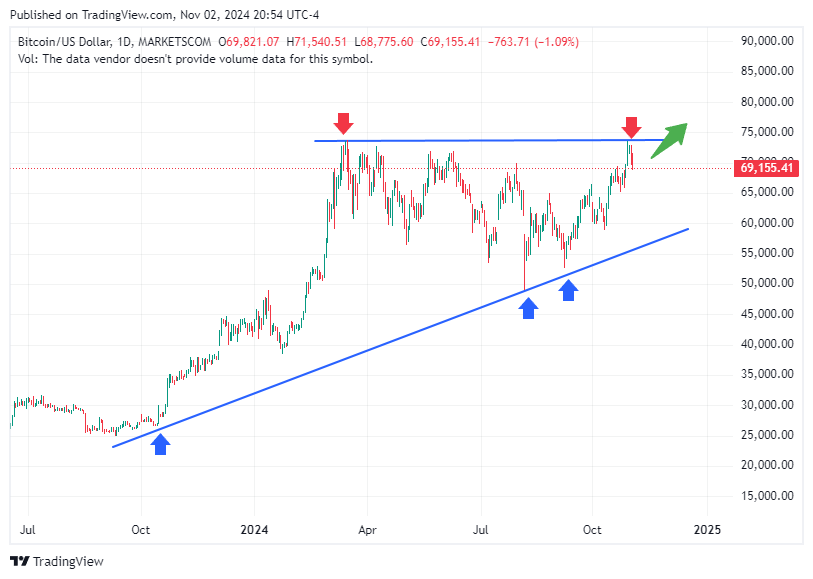
Chart 3️⃣
Let’s zoom in a bit to the last year +
Another way to look at the chart - price consolidating sideways in a range
Break above clear resistance for a breakout?
Or a retest of the up sloping support line - bottom blue line
Chart 4️⃣
Drawn yet another way
Price broke out of obvious resistance and is now retesting breakout
Chart 5️⃣
Blue line - 50 day moving average; price moved well above it and may need retest
Red line - 21 day moving average; 21 above 50 - bullish
You can see on the chart price was making lower lows as designated by the orange circles
Double bottom reversal - green horizontal line
Price marching higher in a ‘higher lows’ fashion - green circle
🧐 Final Bitcoin Analysis
Chart analysis is in the eye of the beholder. These charts are what my eyes see. You may see it differently. To MY eye, there are several technical factors telling me Bitcoin is likely headed higher. Nothing guaranteed. Technical analysis is about the odds.
If price does NOT break above current resistance or if price breaks the pattern of higher lows, then my analysis changes. If price breaks below the 50 day moving average, then my analysis changes. These MUST hold. If they don’t, then my analysis changes. That’s the beauty of being a trader. Rules, not opinions. I change when the chart changes.
For now, I’m long Bitcoin since the $61K area (as a TRADE) and have set my stop loss just below the wick at $65K. My stoploss locks in and guarantees a profit.
Okay, enough about Bitcoin, let’s look at more charts of stocks I’m looking at.
First, the chart of GOLD vs the S&P 500 then a few other BEAUTIFUL charts.
Keep reading with a 7-day free trial
Subscribe to The Tobin Report to keep reading this post and get 7 days of free access to the full post archives.


